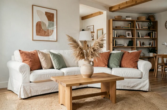
The cool gray palettes have given way. The transformation of an interior now relies on choices of materials and shades that engage the senses, not on an accumulation of small decorative objects. We observe that the most accomplished projects share a common point: they focus on textural coherence before thinking about furniture.
Earthy palette and colorful neutrals: the foundation of a coherent interior decor
The chromatic shift initiated in recent years has taken hold permanently. The soft browns like Mocha Mousse, terracotta, and olive greens are no longer just accents: they form the basis of current residential palettes. Pantone Color Institute highlights Mocha Mousse as the trend color for living spaces, in a range from sunny yellow to chocolate hues.
Working with these shades as a background rather than as a touch radically changes the perception of a space. A whole wall in muted khaki absorbs light differently than an off-white wall enhanced by a khaki cushion. The perceived volume slightly decreases, but the feeling of enveloping increases, which is particularly suitable for living rooms and bedrooms.
We recommend limiting the palette to a maximum of three tones per room: a dominant colorful neutral, a more pronounced accent, and a light color for woodwork or the ceiling. This discipline avoids the patchwork effect produced by too many associations, even when each shade is trendy individually. To delve deeper into this type of chromatic choice, the decor ideas on Les Conseils de Mélanie detail several combinations suitable for common configurations.
Tactile textures as a lever for transformation without renovation
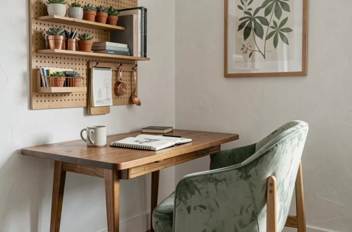
An interior can change its atmosphere without touching a single wall. The current trend of enveloping textures – velvet, boucle, fleece – acts as a true lever for transformation when applied methodically, not by piling throws on a sofa.
The principle is to create a contrast of materials that is perceptible to touch and sight. A textured boucle fabric sofa placed on a smooth floor (waxed concrete, large format tiles) generates a visual tension that a flat fabric sofa on carpet does not offer. Combining this boucle with a corduroy cushion and a dark veined wood coffee table produces three layers of texture without any strong color.
We observe that the combination of dark woods, amber glass, and natural fibers consistently appears in recent projects. Amber glass, in particular, filters light and adds a warm tone without resorting to paint.
Common mistake with textiles
Layering textures of the same thickness (two velvets, two linens) cancels the desired effect. The contrast of thickness is as important as the contrast of material. A fine linen against a thick velvet works. Two velvets side by side create a uniform mass without relief.
Light distribution and ambiance: what classic decor ideas overlook
The majority of articles on interior transformation mention light in passing. In practice, the distribution of light sources conditions the reading of all other decisions (color, texture, furniture).
A single central lighting source (ceiling light, pendant) flattens textures and neutralizes colorful neutrals. Three types of combined sources change the game:
- Indirect lighting (LED strip behind a piece of furniture, shelf backlighting) that reveals the texture of walls and fabrics through grazing light
- Low light points (table lamp, adjustable floor lamp) that create intentional shadow areas and visually carve out the space
- A warm temperature supplementary source (lower than standard neutral white) that enhances earthy tones instead of graying them
The color temperature of the bulb makes or breaks an earthy palette. A terracotta lit with cold white turns dirty pink. The same terracotta under a warm source gains depth. This technical parameter, rarely mentioned in inspiration guides, conditions the success of the project.
Existing furniture and decor style: transforming without replacing
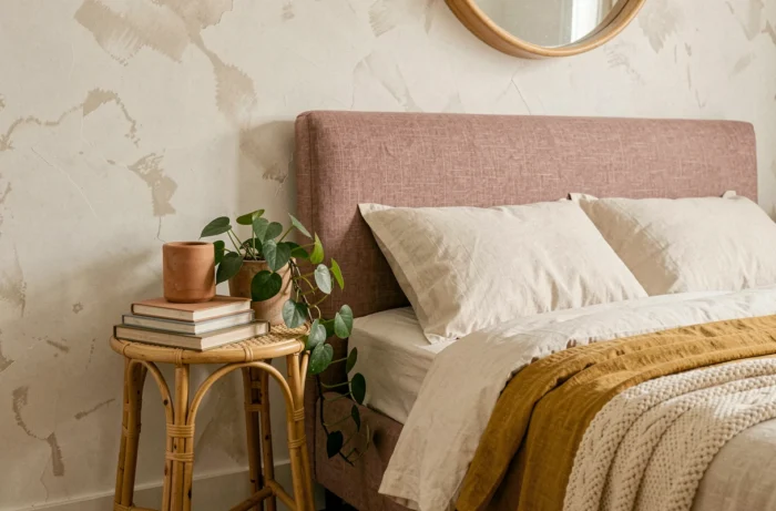
Buying new furniture is not always the answer. An existing piece of furniture changes its register when its immediate environment is modified. A light oak sideboard from the 2010s, perceived as dated in a white and gray living room, effortlessly integrates into a room with olive walls and natural linen textiles.
The principle is based on the notion of coherence of colorimetric temperature. A light wood piece belongs to the family of warm tones. Placed in a cold environment (bluish gray, pure white, chrome metal), it appears incongruous. In a warm environment (earthy walls, brass, plant fibers), it finds its place again.
Before considering a purchase, we recommend testing this reframing:
- Identify the dominant temperature of the furniture (light wood = warm, chrome metal = cold, white lacquer = neutral)
- Adjust the nearest wall or the textile in direct contact (rug under the table, cushion on the chair) to create a continuity of temperature
- Change the handles or legs if the style clashes (brushed brass on a Scandinavian piece is enough to shift it to a more current register)
The case of mixed rooms
A living-dining room often combines two families of furniture. Rather than uniforming, defining two micro-ambiences through the floor textile (rug under the sofa area, bare floor under the table) allows two registers to coexist without inconsistency.
The transformation of an interior relies less on the quantity of added objects than on the rigor of associations. Three technical decisions – limited palette, contrast of textures, appropriate lighting temperature – produce a more readable result than a dozen uncoordinated decorative purchases.